So, this is the sort of project that I really enjoy illustrating.
The goal was cover art for a
new game that's still pretty early in development.
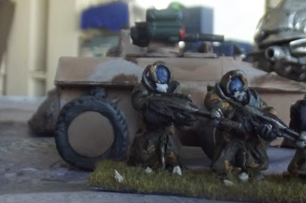
I started with the reference point of several photographs of the creator's scratch builds, which were the to be considered a loose starting point, and one in particular caught my eye:
While the below ones caught some clearer angles that would be useful as reference points, this was the one that I felt told the most interesting story, with the APC providing shelter for the soldiers against the looming insectoid robot.
This is one of the first mostly complete sketches from the process. The core elements from the above photos are present, and I worked on getting a nice dramatic perspective. I added the ant-looking robot to give a little more variety to the action, showing that other stuff was going on in the environment. At this point, the main bug is stalking.
I finished the sketch above, shrinking the focal elements a bit to get some more interest in the background and be a little safer about getting important details away from potential cropped margins. It opened up the space a bit, and reinforces the idea that this is part of a larger world in the larger space. It might be a little faint, but the narrative has shifted a little with the fire distracting the bug from the building in the right background.
The remaining change between the sketch and the line drawing was the background soldiers' placement: I decided to raise the firing one to the middle floor so it wasn't stuck in that little valley created by the edge of the APC and to give it a more heroic angle (which would have been a little artificial if firing from lower). Again, I didn't want the action to get lost too close to the margin but I wanted to keep it interesting, so I placed another soldier in cover there.

I hadn't initially decided to do this, but thought that the heavy backlighting and clouds would give this a suitably somber attitude. Readers of my graphic novel will recognize an easter egg- Havoc graciously offered that I could put my SC ad there as thanks for giving them a nice deal, but I thought something that cartoony would detract from the atmosphere, so instead went with something that conveniently had a bit of irony to it. I also removed the temporary text for the logo, since I was putting in the sky texture at this point.

Back to the original image- I stuck fairly faithful to the original scratch build colors, and originally went with even more green in the wash, but pulled back because I wanted to get a bit more variety in materials: the monochrome look would have been good for interior art, but a leading image needed some more punch to it. One of my favorite things, when the illustration calls for it, is dust, which I rarely get do do, but I thought it fit nicely here. (Hey! I retained something in that Chinese art history course I took! Atmospheric perspective!) I also like glowy reflections, but get to do those a little more often.
Also, I normally don't share testimonials, but this made my day, too:
"Oh my god, I cannot stop loving it. You totally just made my day.
Thanks, Eric.


No comments:
Post a Comment